react-stepper
Well-designed stepper component for reactInstallation
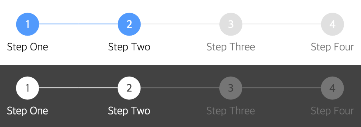
npm install react-stepper-horizontal --saveimport Stepper from 'react-stepper-horizontal'; into your file.Screenshot
Usage
render() {
  return (
    <div>
      <Stepper steps={ [{title: 'Step One'}, {title: 'Step Two'}, {title: 'Step Three'}, {title: 'Step Four'}] } activeStep={ 1 } />
    </div>
  );
}API
Main Component
| name | description | default | type | |----------|----------------|--------------|--------| |activeStep|Active step index, starts at 0|0|number| |steps|List of step objects (see below)||array| |activeColor|Active circle color|#5096FF|string| |completeColor|Completed circle color|#5096FF|string| |defaultColor|Default circle color - not active or completed|#E0E0E0|string| |activeTitleColor|Active title color|#000|string| |completeTitleColor|Completed title color|#000|string| |defaultTitleColor|Default title color - not active or completed|#757575|string| |circleFontColor|Circle text color (for index)|#FFF|string| |size|Circle size|32|number| |circleFontSize|Circle text size|16|number| |titleFontSize|Title text size|16|number| |circleTop|Top margin ofStepper component|24|number|
|titleTop|Space between circle and title|8|number|
|defaultOpacity|Default circle opacity|1|string|
|completeOpacity|Completed circle opacity|1|string|
|activeOpacity|Active circle opacity|1|string|
|defaultTitleOpacity|Default title opacity|1|string|
|completeTitleOpacity|Completed title opacity|1|string|
|activeTitleOpacity|Active title opacity|1|string|
|barStyle|Style of bar separating steps|solid|string|
|defaultBorderColor|Default color of border surrounding circle||string|
|completeBorderColor|Color of border surrounding completed circle||string|
|activeBorderColor|Color of border surrounding active circle||string|
|defaultBorderStyle|Default style of border surrounding circle|solid|string|
|completeBorderStyle|Style of border surrounding completed circle|solid|string|
|activeBorderStyle|Style of border surrounding active circle|solid|string|
|defaultBarColor|Default color of bar separating circles|#E0E0E0|string|
|completeBarColor|Color of bar connected to a completed step|#E0E0E0|string|
|lineMarginOffset|Offset for line margin|4|number|
|defaultBorderWidth|Default Border Width|3|number|