React Native Wheel Color Picker
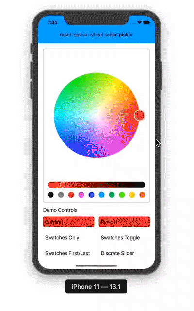
A color picker component for react native.
Features
- Pure JS, lightweight, works on Android, iOS and Web
- Uses hue-saturation color wheel and lightness slider
- Selectable from color swatchs
- Smooth and discrete color slider
- Color change animations on wheel, slider and swatches
 (This demo uses my react-native-advanced-ripple and react-native-elevation modules.)
Installation
``` npm install react-native-wheel-color-picker ```Usage
```js import { Component } from 'react' import { View, Text, ActivityIndicator } from 'react-native' import ColorPicker from 'react-native-wheel-color-picker' class App extends Component {render() {return (<View style={[]}><ColorPickerref={r => { this.picker = r }}color={this.state.currentColor}swatchesOnly={this.state.swatchesOnly}onColorChange={this.onColorChange}onColorChangeComplete={this.onColorChangeComplete}thumbSize={40}sliderSize={40}noSnap={true}row={false}swatchesLast={this.state.swatchesLast}swatches={this.state.swatchesEnabled}discrete={this.state.disc}wheelLodingIndicator={<ActivityIndicator size={40} />}sliderLodingIndicator={<ActivityIndicator size={20} />}useNativeDriver={false}useNativeLayout={false}/><SomeButton onPress={() => this.picker.revert()} /></View>)}Changelog
1.3.1
- fixed a bug related to
useNativeDriver
- no breaking changes
1.3.0
- added changelog section to README.md
- prop added:
wheelLoadingIndicator
- prop added:
sliderLoadingIndicator
- prop added:
useNativeDriver
- prop added:
useNativeLayout
- prop added:
disabled
- prop added:
flipTouchX
- prop added:
flipTouchY
- prop added:
wheelHidden
- fixed a bug related to
discreteLengthprop
- no breaking changes
1.2.0
- prop added:
gapSize
- prop added:
discreteLength
- prop added:
swatchesHitSlop
- prop added:
palette
- prop added:
onInteractionStart
- no breaking changes
1.1.0
- prop added:
shadeWheelThumb
- prop added:
shadeSliderThumb
- prop added:
autoResetSlider
- no breaking changes
API
ColorPicker
Component props and default values
row: false use row or vertical layout
noSnap: false enables snapping on the center of wheel and edges of wheel and slider
thumbSize: 50 wheel color thumb size
sliderSize: 20 slider and slider color thumb size
gapSize: 16 size of gap between slider and wheel
discrete: false use swatches of shades instead of slider
discreteLength: 10 number of swatches of shades, should be > 1
sliderHidden: false if true the slider is hidden
swatches: true show color swatches
swatchesLast: true if false swatches are shown before wheel
swatchesOnly: false show swatch only and hide wheel and slider
swatchesHitSlop: undefined defines how far the touch event can start away from the swatch
color: '#ffffff' color of the color picker
palette: ['#000000','#888888','#ed1c24','#d11cd5','#1633e6','#00aeef','#00c85d','#57ff0a','#ffde17','#f26522'] palette colors of swatches
shadeWheelThumb: true if true the wheel thumb color is shaded
shadeSliderThumb: false if true the slider thumb color is shaded
autoResetSlider: false if true the slider thumb is reset to 0 value when wheel thumb is moved
onInteractionStart: () => {} callback function triggered when user begins dragging slider/wheel
onColorChange: (color) => {} callback function providing current color while user is actively dragging slider/wheel
onColorChangeComplete: (color) => {} callback function providing final color when user stops dragging slider/wheel
wheelLoadingIndicator: null wheel image loading component eg:
sliderLoadingIndicator: null slider image loading component eg:
useNativeDriver: false to use useNativeDriver for animations if possible
useNativeLayout: false to use onLayoutEvent.nativeEvent.layout instead of measureInWindow for x, y, width, height values for wheel and slider measurements which may be useful to prevent some layout problems
disabled: false disable all interactions
flipTouchX: false flip touch positioning on X axis, might be useful in UI with RTL support
flipTouchY: false flip touch positioning on Y axis, might be useful in UI with RTL support
wheelHidden: false if true the wheel is hidden, does not work with sliderHidden = true
Instance methods
revert() reverts the color to the one provided in the color prop