React Native Swipe Up Down


Why using this lib?
- Support iOS & Android
- The best performance 60FPS for UI and JS when swipe up down
- Easy to use, easy to install - no more another package, only JS
Demo
|Full/Mini|Hidden component| |---|---| |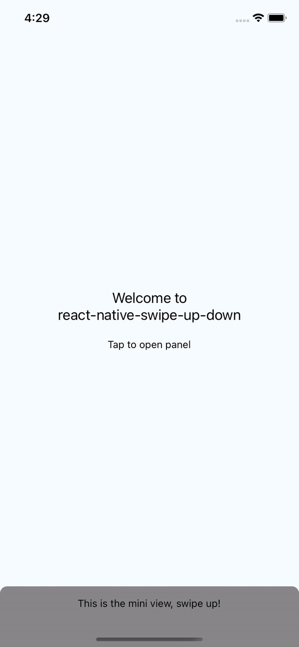 |
| |
|Install
npm install react-native-swipe-up-down --save- OR
yarn add react-native-swipe-up-downUsage
import SwipeUpDown from 'react-native-swipe-up-down';

// TODO: What to do with the module?
<SwipeUpDown
	itemMini={(show) => <ItemFull show={show} />}
	itemFull={(hide) => <ItemFull hide={hide} />}
	onShowMini={() => console.log('mini')}
	onShowFull={() => console.log('full')}
	animation="spring"
	disableSwipeIcon
	extraMarginTop={100}
	iconColor='yellow'
	iconSize={30}
	style={{ backgroundColor: '#000' }} // style for swipe
/>
Note
If you want hidden component just don't pass propsitemMini. It's will hidden. And then you can use hasRef to show it when you want.
And try to using this method to show FullComponentconst swipeUpDownRef = useRef();
// Show component
swipeUpDownRef.current.showFull();
// This ref can help you show component when hidden component
<SwipeUpDown
itemFull={<Test />}
ref={swipeUpDownRef}
/>More Props
animation
animation="easeInEaseOut" - 'linear'
- 'spring'
- 'easeInEaseOut'
- 'none'
swipeHeight
swipeHeight={100} // Default 60extraMarginTop
extraMarginTop={24} // Default iOS: 24 | Android: 0 - Using for padding status bar iOS or max height full componentdisableSwipeIcon
disableSwipeIcon={true}