react-native-stepper
A super simple react-native stepper implementation. Check out the props below for customization.
This package was inspired in react-native-simple-stepper develop by Brian.
Motivation
This is my first package with react-native and i need a stepper implementation that i could use any type of component as a stepper button.Installation
``npm i react-native-stepper --save``Usage
import Stepper from 'react-native-stepper'

//...

render() {
  return (

      //...

      <Stepper
        initValue={duration}
        minValue={0}
        stepValue={1}
        style={stepperStyle}
        decreaseComponent={(<Icon family="Ionicons" name="remove" style={stepperStyle.iconStyle} />)}
        increaseComponent={(<Icon family="Ionicons" name="add" style={stepperStyle.iconStyle} />)}
        valueChanged={(value) => this.onChangeDurationFilter(value)}
      />

      //...

  )
}

onChangeDurationFilter(value) {
  // ... update your app state here
}

//...
Attention !!!
I do not provide any style or default component for decrease and increase buttons, you must provide both. To implement your style you must follow the schema below.const stepperStyle = StyleSheet.create({
containerStyle: {
flexDirection: 'row'
},
decreaseButtonStyle: {
padding: 0,
borderWidth: 2,
borderRightWidth: 1,
borderColor: 'red',
borderTopLeftRadius: 4,
borderBottomLeftRadius: 4
},
increaseButtonStyle: {
padding: 0,
borderWidth: 2,
borderLeftWidth: 1,
borderColor: 'red',
borderTopRightRadius: 4,
borderBottomRightRadius: 4
}
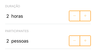
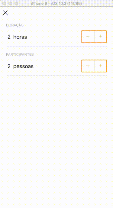
});Demo
Props
| Name | Type |Description | Default | ------------ | ------------- | ------------ |------------ |------------ | | ``initValue` | Number | Initial value. | `0`
| `minValue`` | Number | The minimum value that stepper counter can achieve. | -
| ``maxValue`` | Number | The maximum value that stepper counter can achieve. | -
| ``maxValue` | Number | The max value that stepper counter can achieve. | `1`
| `decreaseComponent` | Component | Component that will be rendered as decrease button | `<Text>-</Text>`
| `increaseComponent` | Component | Component that will be rendered as increase button | `<Text>-</Text>`
| `style`` | StyleSheet Object | Style that will be applied in your stepper component | -
| ``valueChanged` | Function | Fires when the value changes and the value will be passed down for processing like display or calculations. | `FALSE`
| `minMessage`` | String or Function | Message fired when stepper achieve the minimum value | null
| ``maxMessage`` | String or Function | Message fired when stepper achieve the maximum value | null
| ``ignoreMinValidation` | Boolean | !!! | `FALSE`
| `ignoreMaxValidation` | Boolean | !!! | `FALSE``