react-native-step-indicator
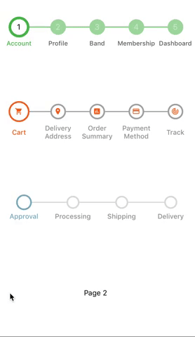
A simple react-native implementation of step indicator widget compatible with the ViewPager and ListView.Features
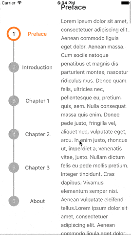
- Can be used with ViewPager and Listview - Custom Styling - Supports vertical and horizontal orientation - Supports animation between steps
 example/HorizontalStepIndicatorExample.js example/VerticalStepIndicatorExample.js
Example
$ yarn
$ yarn example ios   // For ios
$ yarn example android   // For Android
Installation
`npm install react-native-step-indicator --save`or
`
yarn add react-native-step-indicator`Usage
import StepIndicator from 'react-native-step-indicator';

const labels = ["Cart","Delivery Address","Order Summary","Payment Method","Track"];
const customStyles = {
  stepIndicatorSize: 25,
  currentStepIndicatorSize:30,
  separatorStrokeWidth: 2,
  currentStepStrokeWidth: 3,
  stepStrokeCurrentColor: '#fe7013',
  stepStrokeWidth: 3,
  stepStrokeFinishedColor: '#fe7013',
  stepStrokeUnFinishedColor: '#aaaaaa',
  separatorFinishedColor: '#fe7013',
  separatorUnFinishedColor: '#aaaaaa',
  stepIndicatorFinishedColor: '#fe7013',
  stepIndicatorUnFinishedColor: '#ffffff',
  stepIndicatorCurrentColor: '#ffffff',
  stepIndicatorLabelFontSize: 13,
  currentStepIndicatorLabelFontSize: 13,
  stepIndicatorLabelCurrentColor: '#fe7013',
  stepIndicatorLabelFinishedColor: '#ffffff',
  stepIndicatorLabelUnFinishedColor: '#aaaaaa',
  labelColor: '#999999',
  labelSize: 13,
  currentStepLabelColor: '#fe7013'
}


constructor() {
    this.state = {
        currentPosition: 0
    }
}

render() {
  return (
    <StepIndicator
         customStyles={customStyles}
         currentPosition={this.state.currentPosition}
         labels={labels}
    />
  )
}

onPageChange(position){
    this.setState({currentPosition: position});
}
//...
Properties
| Name | Type | Description | Default | ------------ | ------------- | ------------ |------------ | |currentPosition | Number | Current position in steps | 0
| ``stepCount`` | Number | Number of steps | 5
| ``direction`` | String | Orientation(i.e. horizontal,vertical) | horizontal
| ``customStyles`` | Object | Custom styling | {}
| ``labels`` | Array | Labels for each step | null
| onPress | Function (position: Number) | Function called when a step is pressed | null
| renderStepIndicator | Function (position: Number, stepStatus: String) | Use this to render custom content inside step | null
| renderLabel | Function (position: Number, stepStatus: String, label: String, currentPosition: Number) | Use this to render custom label for each step | null Custom Styles
| Name | Type | Default | ------------ | ------------ |------------ | | ``stepIndicatorSize`` | Number | 30
| ``currentStepIndicatorSize`` | Number | 40
| ``separatorStrokeWidth`` | Number | 3
| ``separatorStrokeUnfinishedWidth`` | Number | 0
| ``separatorStrokeFinishedWidth`` | Number | 0
| ``stepStrokeWidth`` | Number | 0
| ``currentStepStrokeWidth`` | Number | 5
| ``stepStrokeCurrentColor`` | String | '#4aae4f'
| ``stepStrokeFinishedColor`` | String | '#4aae4f'
| ``stepStrokeUnFinishedColor`` | String | '#4aae4f'
| ``separatorFinishedColor`` | String | '#4aae4f'
| ``separatorUnFinishedColor`` | String | '#a4d4a5'
| ``stepIndicatorFinishedColor`` | String | '#4aae4f'
| ``stepIndicatorUnFinishedColor`` | String | '#a4d4a5'
| ``stepIndicatorCurrentColor`` | String | '#ffffff'
| ``stepIndicatorLabelFontSize`` | Number | 15
| ``currentStepIndicatorLabelFontSize`` | Number | 15
| ``stepIndicatorLabelCurrentColor`` | String | '#000000'
| ``stepIndicatorLabelFinishedColor`` | String | '#ffffff'
| ``stepIndicatorLabelUnFinishedColor`` | String | 'rgba(255,255,255,0.5)'
| ``labelColor`` | String | '#000000'
| ``currentStepLabelColor`` | String | '#4aae4f'
| ``labelSize`` | Number | 13
| ``labelAlign`` | String | 'center'
| ``labelFontFamily`` | String |