react-native-multiple-select-list
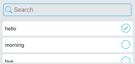
Multiple select list with search barInstall :
npm install --save react-native-multiple-select-listExample usage :
import CustomMultiPicker from "react-native-multiple-select-list";

const userList = {
  "123":"Tom",
  "124":"Michael",
  "125":"Christin"
}

<CustomMultiPicker
  options={userList}
  search={true} // should show search bar?
  multiple={true} //
  placeholder={"Search"}
  placeholderTextColor={'#757575'}
  returnValue={"label"} // label or value
  callback={(res)=>{ console.log(res) }} // callback, array of selected items
  rowBackgroundColor={"#eee"}
  rowHeight={40}
  rowRadius={5}
  iconColor={"#00a2dd"}
  iconSize={30}
  selectedIconName={"ios-checkmark-circle-outline"}
  unselectedIconName={"ios-radio-button-off-outline"}
  scrollViewHeight={130}
  selected={[1,2]} // list of options which are selected by default
/>