


react-id-swiper ( Newest version 4.0.0 )
A library to use Swiper as a ReactJs component
What is Swiper?
Swiper - is the free and most modern mobile touch slider with hardware accelerated transitions and amazing native behavior.It is intended to be used in mobile websites, mobile web apps, and mobile native/hybrid apps. Designed mostly for iOS, but also works great on latest Android, Windows Phone 8 and modern Desktop browsers.
Swiper is not compatible with all platforms, it is a modern touch slider which is focused only on modern apps/platforms to bring the best experience and simplicity. Swiper does work well with Gatsby.
Props
| Name | Type | Default value | Description |
| ------------------ | -------- | ---------------- | -------------------------------------------------|
| ContainerEl | String | 'div' | Element type for container |
| containerClass | String | swiper-container | Swiper container class name |
| WrapperEl | String | 'div' | Element type for wrapper |
| wrapperClass | String | swiper-wrapper | Swiper wrapper class name |
| slideClass | String | swiper-slide | Swiper slide class name |
| shouldSwiperUpdate | Boolean | false | Update swiper when component is updated |
| rebuildOnUpdate | Boolean | false | Rebuild swiper when component is updated |
| noSwiping | Boolean | false | Disable swiping by condition |
| activeSlideKey | String | null | Initial slide index |
| renderPrevButton | function | | Render props function for prev button |
| renderNextButton | function | | Render props function for next button |
| renderScrollbar | function | | Render props function for scrollbar |
| renderPagination | function | | Render props function for pagination |
| renderParallax | function | | Render props function for parallax |If you want to use Swiper custom build to reduce bundle size, you need to use extra props below.
Custom build extra props
| Name | Type | Default value | Description |
| ------------------ | -------- | ---------------- | -------------------------------------------------|
| Swiper | Class | | Swiper class |
| modules | array | | Array of Swiper necessary modules |NOTE:
- You can also use Swiper's original params too. Swiper API documentation HERE
- Find more info about Swiper custom build HERE
- <= 3.x documentation
Documentation
Installation and setup
- From version 2.0.0, it requires React & ReactDOM ver >=16.8.0 to use Hooks
- From version 2.4.0, it requires Swiper ver >= 5.0.0
Npm package
By npm
npm install --save react-id-swiper@latest swiper@latestBy Yarn
yarn add react-id-swiper@latest swiper@latestCDN
<script src="https://unpkg.com/react-id-swiper@3.0.0/lib/react-id-swiper.js"></script><script src="https://unpkg.com/react-id-swiper@3.0.0/lib/react-id-swiper.min.js"></script>Styling
Swiper stylesheet file is requiredUse Swiper stylesheet file from CDN
<link rel="stylesheet" href="https://unpkg.com/swiper/css/swiper.css"><link rel="stylesheet" href="https://unpkg.com/swiper/css/swiper.min.css">Or from Swiper package
You should import directly from
Swiper package which supports css, scss and lesscss
import 'swiper/css/swiper.css'scss
import 'swiper/swiper.scss'less
import 'swiper/swiper.less'Examples
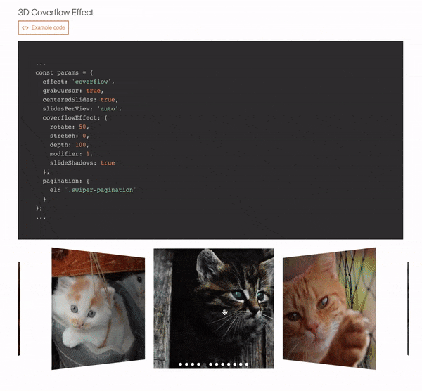
Numerous live examples:>Navigation, Pagination, Pagination / Dynamic Bullets, Progress Pagination, Fraction Pagination, Custom Pagination, Scrollbar, Vertical slider, Space Between Slides, Mutiple Slides Per View, Auto Slides Per View / Carousel Mode, Centered Slides, Centered Slides + Auto Slides Per View, Free Mode / No Fixed Positions, Scroll Container, Multiple Row Slides Layout, Nested Swipers, Grab Cursor, Loop Mode / Infinite Loop, Loop Mode With Multiple Slides Per Group, Fade Effect, 3D Cube Effect, 3D Coverflow Effect, 3D Flip Effect, Mousewheel-control, Auto Play, Thumbs Gallery With Two-way Control, RTL Layout, Parallax, Lazyload Image, Responsive Breakpoints, Manipulating component outside Swiper, Customized Component
Default
import React from 'react';
import Swiper from 'react-id-swiper';
import 'swiper/css/swiper.css';

const SimpleSwiper = () => (
  <Swiper>
    <div>Slide 1</div>
    <div>Slide 2</div>
    <div>Slide 3</div>
    <div>Slide 4</div>
    <div>Slide 5</div>
  </Swiper>
)

export default SimpleSwiper;
Using params
import React from 'react';
import Swiper from 'react-id-swiper';

const SimpleSwiperWithParams = () => {
  const params = {
    pagination: {
      el: '.swiper-pagination',
      type: 'bullets',
      clickable: true
    },
    navigation: {
      nextEl: '.swiper-button-next',
      prevEl: '.swiper-button-prev'
    },
    spaceBetween: 30
  }

  return(
    <Swiper {...params}>
      <div>Slide 1</div>
      <div>Slide 2</div>
      <div>Slide 3</div>
      <div>Slide 4</div>
      <div>Slide 5</div>
    </Swiper>
  )
}

export default SimpleSwiperWithParams;
Manipulating swiper from outside swiper component
import React, { useState, useRef } from 'react';
import Swiper from 'react-id-swiper';

const ManipulatingSwiper = () => {
  const [swiper, setSwiper] = useState(null);

  const ref = useRef(null);

  const goNext = () => {
    if (ref.current !== null && ref.current.swiper !== null) {
      swiper.slideNext();
    }
  };

  const goPrev = () => {
    if (ref.current !== null && ref.current.swiper !== null) {
      swiper.slidePrev();
    }
  };

  return (
    <div>
      <Swiper ref={ref}>
        <div>Slide 1</div>
        <div>Slide 2</div>
        <div>Slide 3</div>
        <div>Slide 4</div>
        <div>Slide 5</div>
      </Swiper>
      <button onClick={goPrev}>Prev</button>
      <button onClick={goNext}>Next</button>
    </div>
  );
};

export default ManipulatingSwiper;
Custom build Swiper
You can find the WORKING DEMO REPO HEREimport React from 'react';
import ReactIdSwiperCustom from 'react-id-swiper/lib/ReactIdSwiper.custom';
import { Swiper, Navigation, Pagination } from 'swiper/js/swiper.esm';
const CustomBuildSwiper = () => {
const params = {
// Provide Swiper class as props
Swiper,
// Add modules you need
modules: [Navigation, Pagination],
pagination: {
el: '.swiper-pagination',
type: 'bullets',
clickable: true
},
navigation: {
nextEl: '.swiper-button-next',
prevEl: '.swiper-button-prev'
},
spaceBetween: 30
}
return(
<ReactIdSwiperCustom {...params}>
<div>Slide 1</div>
<div>Slide 2</div>
<div>Slide 3</div>
<div>Slide 4</div>
<div>Slide 5</div>
</ReactIdSwiperCustom>
)
}
export default CustomBuildSwiper;NOTE:
- If you use Webpack & Babel you need to setup Babel loader config in
webpack.config.jslike below:
module: {
  rules: [
    {
      exclude: [/node_modules\/(?!(swiper|dom7)\/).*/, /\.test\.js(x)?$/],
      test: /\.js(x)?$/,
      use: [{ loader: 'babel-loader' }],
    }
  ],
}
Adding customized css classes
const params = {
  pagination: {
    el: '.swiper-pagination.customized-swiper-pagination',
  }, // Add your class name for pagination container
  navigation: {
    nextEl: '.swiper-button-next.customized-swiper-button-next', // Add your class name for next button
    prevEl: '.swiper-button-prev.customized-swiper-button-prev' // Add your class name for prev button
  },
  containerClass: 'customized-swiper-container' // Replace swiper-container with customized-swiper-container
}
Adding customized components
For customized rendering to work, you have to use same classname with params el.const params = {
navigation: {
nextEl: '.swiper-button-next',
prevEl: '.swiper-button-prev'
},
renderPrevButton: () => <button className="swiper-button-prev">Prev</button>,
renderNextButton: () => <button className="swiper-button-next">Next</button>,
}Workable slides
Each slide should be wrapped by HTML elementBAD CODE :thumbsdown:
<Swiper {...params}>
  Slide content
</Swiper>
GOOD CODE :thumbsup:
<Swiper {...params}>
  <span>Slide content</span>
</Swiper>
Bug report
Please use the prepared Codesanbox below to reproduce your issue. Thank you!!
Authors
- Asher Nguyen - Initial work - Asher Nguyen
See also the list of contributors who participated in this project.
Buy me a coffee

License
This project is licensed under the MIT License - see the LICENSE file for details