rc-tree
Tree component.!NPM versionnpm-imagenpm-url
 !build statusgithub-actions-imagegithub-actions-url !Test coveragecodecov-imagecodecov-url !Dependenciesdavid-imagedavid-url !DevDependenciesdavid-dev-imagedavid-dev-url !npm downloaddownload-imagedownload-url !bundle sizebundlephobia-imagebundlephobia-url
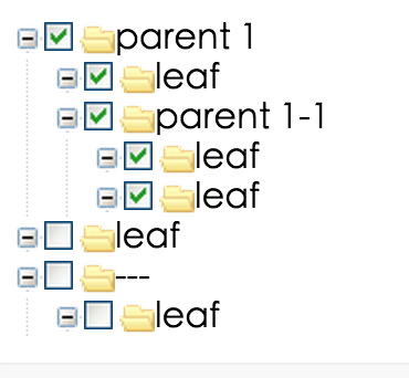
Screenshots
Feature
- Support all popular browsers, including Internet Explorer 9 and above.
Example
http://localhost:9001/online example: https://tree.react-component.now.sh/
Install

Usage
Note: import "rc-tree/assets/index.css"see examples
API
Tree props
| name | description | type | default | | --- | --- | --- | --- | | autoExpandParent | whether auto expand parent treeNodes | bool | false | | checkable | whether support checked | bool/React Node | false | | checkedKeys | Controlled checked treeNodes(After setting, defaultCheckedKeys will not work). Note: parent and children nodes are associated, if the parent node's key exists, it all children node will be checked, and vice versa. When set checkable and checkStrictly, it should be an object, which contains checked array and halfChecked array. | String/{checked:Array,halfChecked:Array} | | | checkStrictly | check node precisely, parent and children nodes are not associated | bool | false | | className | additional css class of root dom node | String | '' | | defaultCheckedKeys | default checked treeNodes | String | | | defaultExpandedKeys | expand specific treeNodes | String | | | defaultExpandAll | expand all treeNodes | bool | false | | defaultExpandParent | auto expand parent treeNodes when init | bool | true | | defaultSelectedKeys | default selected treeNodes | String | | | disabled | whether disabled the tree | bool | false | | draggable | whether can drag treeNode. (drag events are not supported in Internet Explorer 8 and earlier versions or Safari 5.1 and earlier versions.) | bool \| ({ node }) => boolean | false | | expandedKeys | Controlled expand specific treeNodes | String | - | | filterTreeNode | filter some treeNodes as you need. it should return true | function(node) | - | | icon | customize icon. When you pass component, whose render will receive full TreeNode props as component props | element/Function(props) | - | | loadedKeys | Mark node is loaded whenloadData is true | String | - |
| loadData | load data asynchronously and the return value should be a promise | function(node) | - |
| multiple | whether multiple select | bool | false |
| prefixCls | prefix class | String | 'rc-tree' |
| selectable | whether can be selected | bool | true |
| selectedKeys | Controlled selected treeNodes(After setting, defaultSelectedKeys will not work) | String | |
| showIcon | whether show icon | bool | true |
| showLine | whether show line | bool | false |
| treeData | treeNodes data Array, if set it then you need not to construct children TreeNode. (value should be unique across the whole array) | array<{key,title,children, disabled, selectable}> | - |
| onCheck | click the treeNode/checkbox to fire | function(checkedKeys, e:{checked: bool, checkedNodes, node, event, nativeEvent}) | - |
| onExpand | fire on treeNode expand or not | function(expandedKeys, {expanded: bool, node, nativeEvent}) | - |
| onDragEnd | it execs when fire the tree's dragend event | function({event,node}) | - |
| onDragEnter | it execs when fire the tree's dragenter event | function({event,node,expandedKeys}) | - |
| onDragLeave | it execs when fire the tree's dragleave event | function({event,node}) | - |
| onDragOver | it execs when fire the tree's dragover event | function({event,node}) | - |
| onDragStart | it execs when fire the tree's dragstart event | function({event,node}) | - |
| onDrop | it execs when fire the tree's drop event | function({event, node, dragNode, dragNodesKeys}) | - |
| onLoad | Trigger when a node is loaded. If you set the loadedKeys, you must handle onLoad to avoid infinity loop | function(loadedKeys, {event, node}) | - |
| onMouseEnter | call when mouse enter a treeNode | function({event,node}) | - |
| onMouseLeave | call when mouse leave a treeNode | function({event,node}) | - |
| onRightClick | select current treeNode and show customized contextmenu | function({event,node}) | - |
| onSelect | click the treeNode to fire | function(selectedKeys, e:{selected: bool, selectedNodes, node, event, nativeEvent}) | - |
| switcherIcon | specific the switcher icon. | ReactNode / (props: TreeNodeAttribute) => ReactNode | - |
| virtual | Disable virtual scroll when false | boolean | - |
| allowDrop | Whether to allow drop on node | ({ dragNode, dropNode, dropPosition }) => boolean | - |
| dropIndicatorRender | The indicator to render when dragging | ({ dropPosition, dropLevelOffset, indent: number, prefixCls }) => ReactNode| - |
| direction | Display direction of the tree, it may affect dragging behavior | ltr \| rtl | - |
| expandAction | Tree open logic, optional: false \| click \| doubleClick | string \| boolean | click |TreeNode props
note: if you have a lot of TreeNode, like more than 1000,
make the parent node is collapsed by default, will obvious effect, very fast.
Because the children hide TreeNode will not insert into dom.
| name | description | type | default | | --- | --- | --- | --- | | className | additional class to treeNode | String | '' | | checkable | control node checkable if Tree is checkable | bool | false | | style | set style to treeNode | Object | '' | | disabled | whether disabled the treeNode | bool | false | | disableCheckbox | whether disable the treeNode' checkbox | bool | false | | title | tree/subTree's title | String/element/((data: DataNode) => React.ReactNode) | '---' | | key | it's used with tree props's (default)ExpandedKeys / (default)CheckedKeys / (default)SelectedKeys. you'd better to set it, and it must be unique in the tree's all treeNodes | String | treeNode's position | | isLeaf | whether it's leaf node | bool | false | | icon | customize icon. When you pass component, whose render will receive full TreeNode props as component props | element/Function(props) | - | | switcherIcon | specific the switcher icon. | ReactNode / (props: TreeNodeAttribute) => ReactNode | - |
Note
The number of treeNodes can be very large, but when enablecheckable, it will spend more computing time, so we cached some calculations(e.g. this.treeNodesStates), to avoid double computing. But, this bring some restrictions, when you async load treeNodes, you should render tree like this {this.state.treeData.length ? <Tree ...>{this.state.treeData.map(t => <TreeNode ... />)}</Tree> : 'loading tree'}Development
npm install
npm start